Using a Presidential Election as an Example
I feel a bit weird using a pretty divisive period in people’s lives. (Divisive was the word everyone else was using, and I just want to be included, okay.) However, after feeling empty and spending a weekend eating my feelings, I decided to use this as a learning opportunity. It took a bit, but I got the data on my side. Well, most of the data. Apparently, getting all the data I wanted is super difficult to impossible. Also, I an new to using the program I used to make figures, so I hope everything is understandable. Either way… on to the learning.
How Data is Presented Changes How You Feel About Said Data
First, let’s start with how the election results were first presented to everyone. I, unlike some people, didn’t stay up all night watching the results come in. Shown below is essentially how the news was reported when I woke up the next morning.

This graph shows a complete “victory” based on getting to the 270 Electoral College Vote benchmark. No matter your feelings about the Electoral College system, this is the way the United States currently does presidential elections, so we use it. Also, Alaska and Hawaii look gigantic. This was how I figured it out without doing any external editing of the figure. The color saturation is what I want you to focus on.
Depending on your feelings, this either filled your with dread or elation. Your feelings are completely valid. This is how the data was presented to you. Would using a different color have told you something different? Possibly. Within the context of the US Presidential Election, it is well established that red denotes the Republican Party and blue denotes the Democratic Party. What if I colored the figure orange? Would you feel the same way? What about grey?
For this example, let’s continue with our standard coloring scheme. Most people hadn’t dug too deeply yet into what this data meant. If you were to dig a small bit deeper, how would your feelings change? What if we presented the data based on the percentage of Electoral College Votes granted.

In this graph, the transparency has been altered based on the percent change in Electoral College Votes won. In this case, there was a 16% difference in the Electoral College Votes allotted to each party, with the Republican Party having a bigger portion.
My personal opinion is that the results are a lot more tempered and do not evoke as much of a reaction as the first image. It doesn’t show as heavy of a concentration of a particular votes as the previous figure. Now, what if you dug even deeper and looked at the actual vote count?

In this graph, the transparency has been altered to consider the percent change in popular vote. In this case, there was a 1% difference in the votes allotted to each party with the Republican Party getting the bigger portion.
Now, how does this graph make you feel? Confused? Concerned that I must be showing you a broken plot? Nope. This is legitimately how the data presented itself. There is essentially no point in me showing you this graph, except for that being the point.
Using the exact same data from a singular Excel or CSV file, I was able to show this data in three completely different ways: overall victor, percent change in Electoral College votes, and percent change in total vote. My personal opinion is that the very last graph is the one that matters. Based on the results, this would technically be the one that accounts for every single vote of everyone who cast a ballot. What does this mean to me? Well, nothing really happened, and I think that is how everyone should essentially be looking at this.
However, something you may say is that “I look at the results based on Electoral College votes allotted by each state. You looking at the entirety of the United States is useless to me.”
Okay. I can work with that.
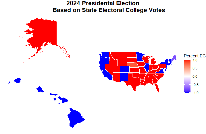
Here is the data based on the percentage of Electoral College votes each state allotted to the parties. Since we have more than one direction of the data, I decided I would allow you to have a legend. The positive direction is the Republican Party since they were the overall victor, as seen in the first figure. The negative direction is the Democratic Party. I would also like to note that I how to show the percentage of Electoral College votes because Maine and Nebraska are not “Winner-Takes-All” states. Based on congressional district, there is a possibility of a vote going to the other party.
Now, I still disagree with how the data is presented because it gives the impression that based on how you voted, you may be welcomed in certain states. Based on this map, I have lived and visited “Red” and “Blue” states. It’s more or less the same. Granted I’ve mostly been to cities rather than rural areas, but that’s beside the point. I hope that everyone will feel welcome no matter where they go. That is not a hundred percent true yet, but I hope we are on our way there. Anyway, a better way I think of looking at this data would be to look at the percent change in votes in each state.
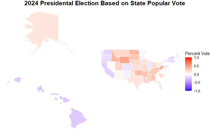
Here is the same data, except for the percent change in actual votes. The scale is also the same as before.
My personal opinion, again, but I think we have a much more tempered graph similar the the third graph, which looked at the entirety of the United States. There are areas that seem much more noteworthy and others that are barely a blot on the radar, but still, we could do a lot better.
Remember how I mentioned that this wasn’t all the data I wanted…
Well, that’s what I want to discuss now. I would have loved to go even more in-depth and look at the election on a county level. The problem: I could not find a database that gave me all that information in one place. How I got the above data was copying and pasting a Wikipedia Article into Excel. Super quick and easy. However, when I wanted to look a county data, each state wanted me to go to their individual government pages, and I gave myself a deadline for when I wanted to post this. (If you want to see me go through that data, let me know.)
Putting that to the size, would that even be a better way to represent that data? For example, the sizes of counties differ the same way state size differs. The population density of counties also changes the same way state density changes. There is a way to standardize for both of those, but that comes with another problem. To standardize, there would need to be a way to exactly or approximately geolocate everyone who cast their ballot depending on the polling location or their actual address.
Whelp…
I hope that never happens and completely believe that everyone’s vote is a private matter between them and whomever they choose to tell. It’s absolutely none of my business and it shouldn’t be anyone else’s.
Well, I showed you five different ways we can view the data from the election, and hope that is is understandable why data presentation can affect how we view the results. Good thing there’s nothing else wrong with the data.
Right?
Sorry, there’s even more wrong with the data.
I wish I could tell you in all seriousness that I was sorry, but I’m really not. There is even more that we need to consider, such as the fact that this is a participatory survey with some guidelines.
I know it sounds weird. We want to believe that elections are snapshots of the general thinking of a population, but there are some problems with that. In truth, the election has just one less problem than the polling that people criticize in the lead up to the election: elections are anonymous. Theoretically, you can track down everyone’s vote, but a random person is not looking you directly in the eye, asking what your vote is going to be. If you are a people-pleaser like me, what are the changes you are going to give the person an answer they want to hear? Or maybe you want to be confrontational and give an answer, not because you actually believe it, but because you think it would be funny? There is all of that you need to consider with polling. Plus, here is a list of other things as to why elections may not be best way to feel the pulse of the entire country.
You must turn 18 years of age before the election
This may sound like a technicality, but continue to go with me. Younger people may not be able to vote, but they have many opinions about things and whether things are going they way they want. In different political causes, input and conversations are occurring with people who cannot vote yet; however, they are still very much involved in the political landscape. Either way you see it, it is a large portion of the population we are, off the bat, not hearing from when we get these snapshots.
Disenfranchisement – whether real or imagined
There are plenty of ways in which people can feel disenfranchised from voting. There may be laws in place that make it harder for certain people to vote, or people may feel that the system is rigged against them. Elections are a participatory system based on the people who decided to vote. I am not informed enough to go into details as to why everyone who doesn’t vote doesn’t vote, but that is still something to consider when considering an election.
The Question Being Asked
As you may know, the question being asked is “Who do you want as your president?” But if you dig deeper into that, you start to realize that that is not the actual question. The questions are:
What is your stance on immigration?
What are your feelings about the economy?
Do you think taxes should go up or down?
How do you think all these government agencies should be run?
What type of rights do we allot to different people?
There are so many more that I cannot possibly think of right now. Somehow, we have boiled down a complicated series of questions into a single one: Who? That usually leads us to think of the question that is most important to us and vote based on that. Mathematically, it is nearly impossible for everyone to have the exact same opinion on all the same subjects. For example, for only the question listed above, there is a 1 / (2^5) or 1 in 32 chance that a person leans one particular way on all five questions. For two people, that becomes 1 in 1024. Now, consider the millions of people who vote and those who don’t. Now, consider that there are more than two sides to every issue. Considering all of that, there is a 0% chance that everyone will think the exact same way.
Take away
Hopefully, through all of this, you learned that how data is presented affects how you may feel about said data. The deeper that you look a something, the more uncertainty there may be. Simply turning the results into percentages drastically changed how the data looked even though, number-wise, it was the exact same data. Realizing that polls and election are pretty much glorified surveys changes how you may think about it. Also, the question being asked encompasses so much that it is impossible for a single question to answer.
In essence, I may have just shown you this one instance of how data is being presented changing how people feel about a particular subject. You can extrapolate that to go even further. Maybe what you are considering a fact may just be how it was presented to you within questioning it further. Also, once you add politics to it, it gets even more murky.
Below is an example of such. In the video below, people were asked the same question using the same data, and depending on their political leaning on the subject, their response is very different.
Now, what can you do with this information? Ask more questions. Listen to people you might now agree with. I cannot tell you how many times I listen to people I disagree with only to realize we are starting from the same “fact.” How their data was presented or the life experience they had is why we vastly disagree. Find common ground with people, because that is the only way we can get anything done. Yes, everything political has become more divisive, but I don’t believe that it has to destroy us.
If you want the original data and my coding for the figures presented, you can find them on GitHub. If you find anything wrong with my coding, feel free to tell me; I am always learning. If there is something you want to say in the comments, feel free to pass it on.
